〈從米粒到米香,延續的是世代的香氣〉
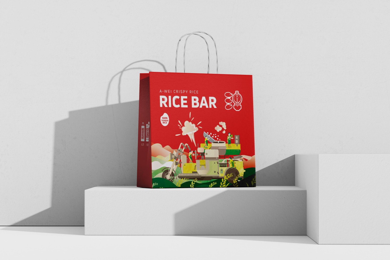
阿瑋米香源自彰化,由創辦人阿瑋自台北返鄉後創立。
他帶著三輪攤車與傳統爆米香工藝重新扎根,
堅持選用第三方檢驗合格的新鮮米與花生,
直接向小農購買,以支持友善土地與在地耕作。
透過對溫度與麥芽的精細掌握,成就「酥脆不黏牙」的口感,
讓傳統米香在健康與美味之間取得平衡。
品牌同時積極推動食農教育,透過 DIY 與校園分享,
傳遞食材來源與健康飲食的價值,逐步成為彰化具代表性的在地品牌。
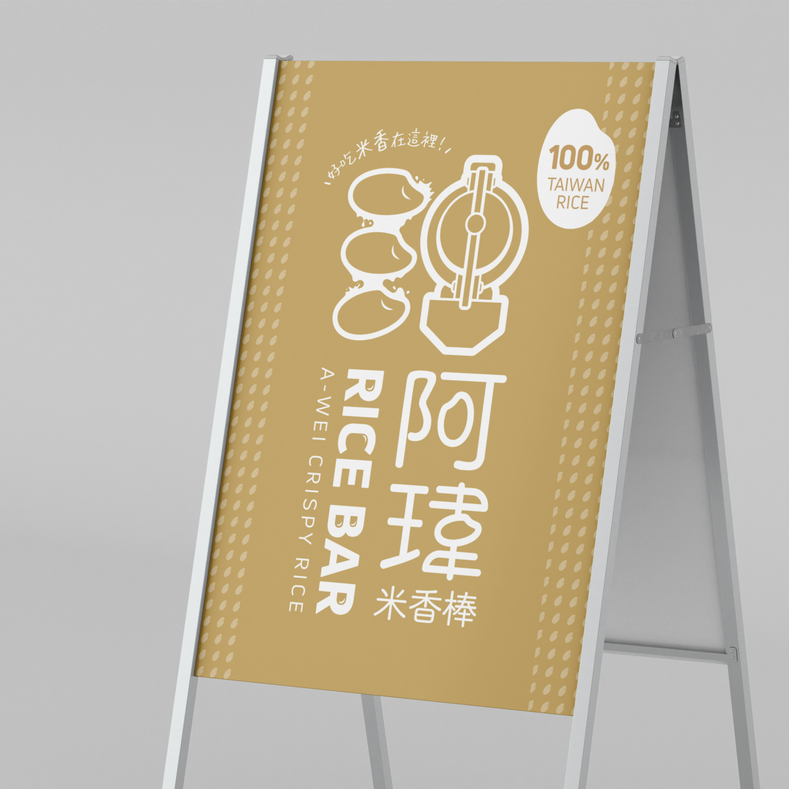
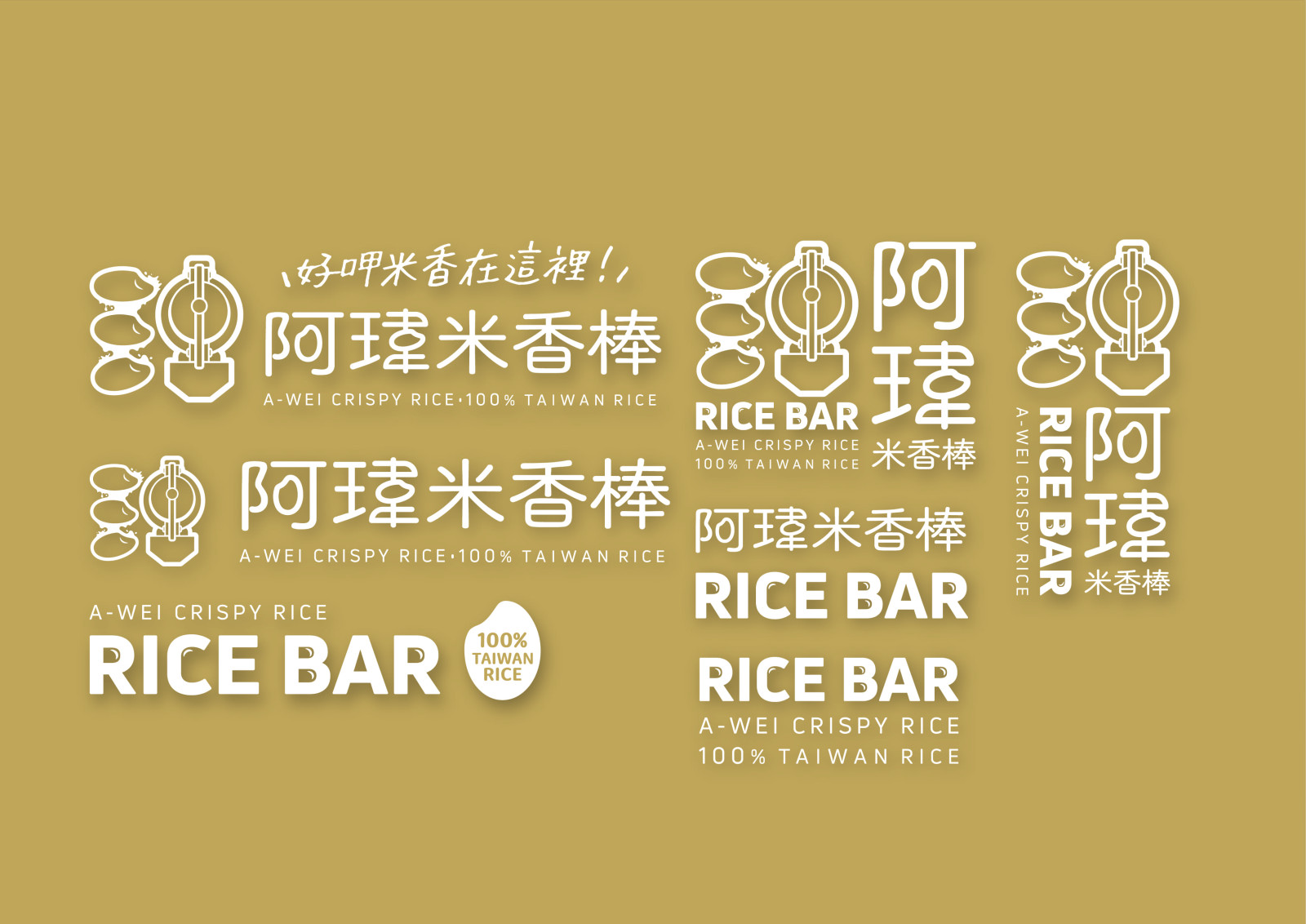
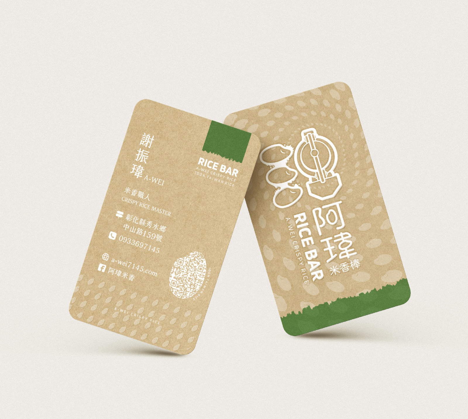
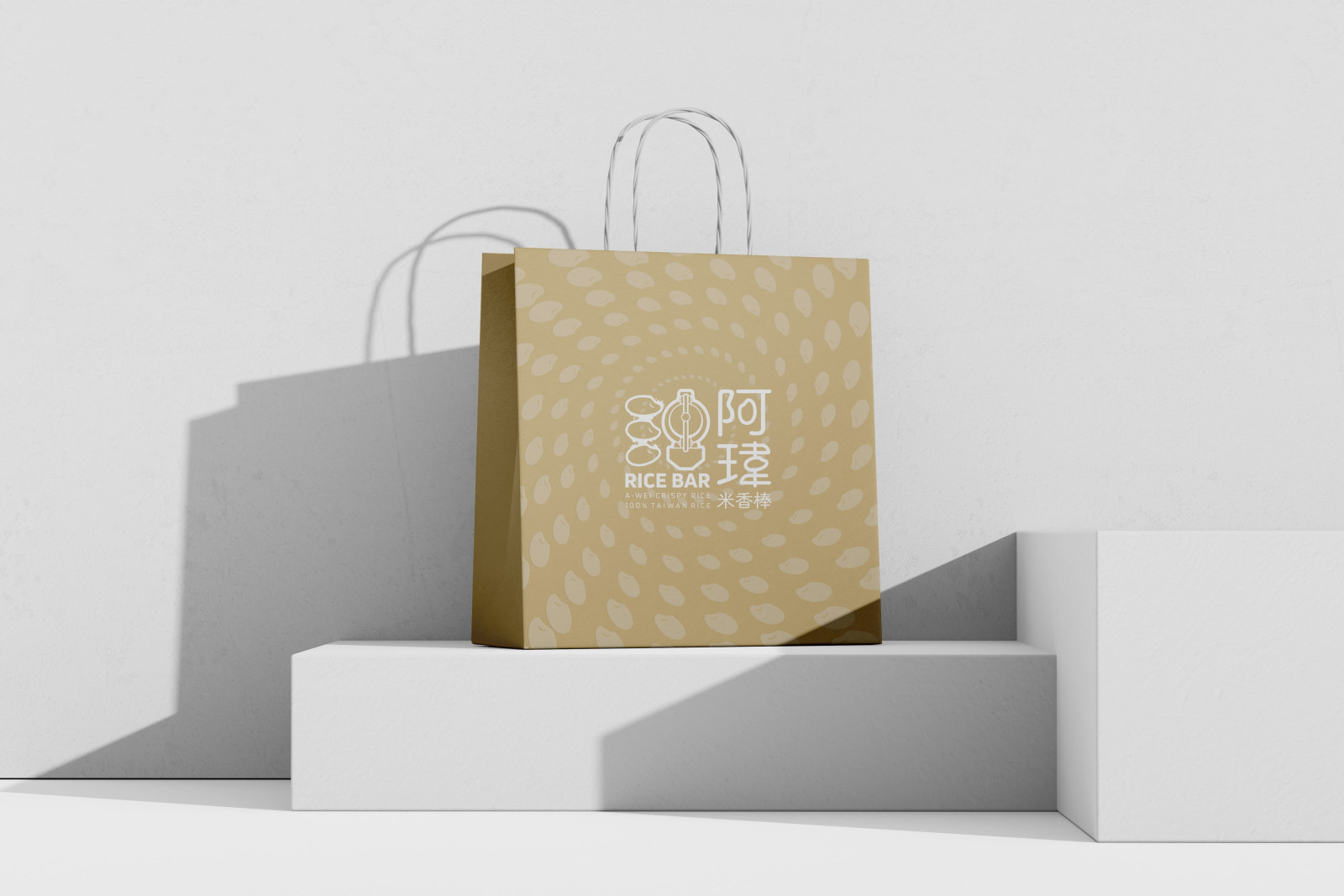
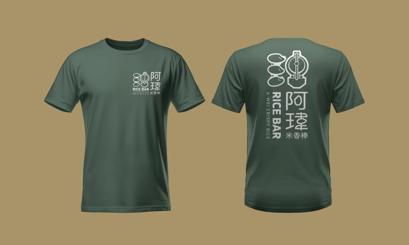
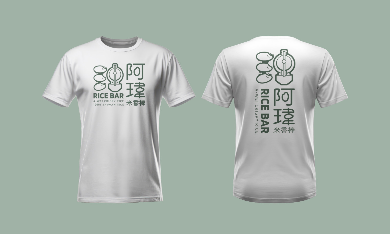
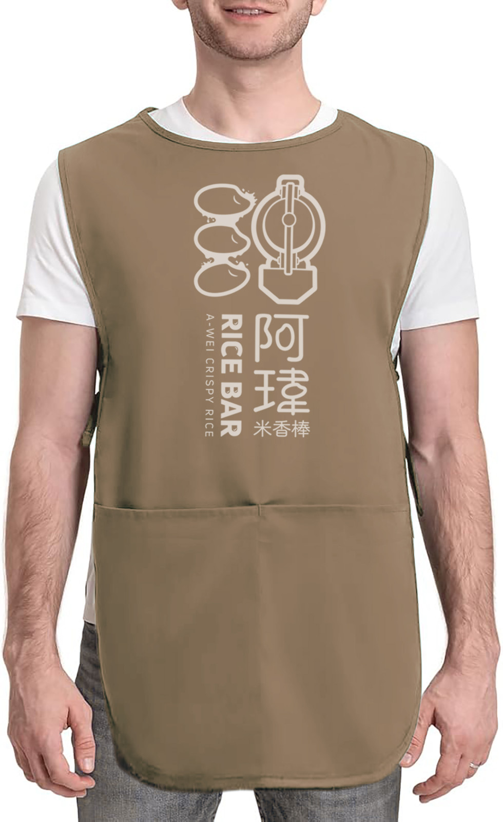
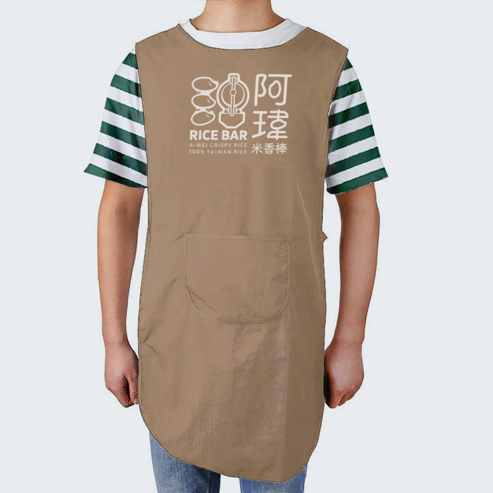
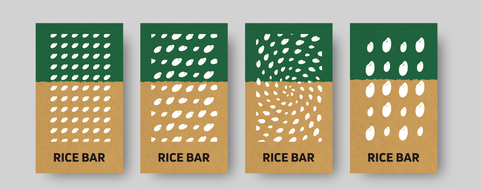
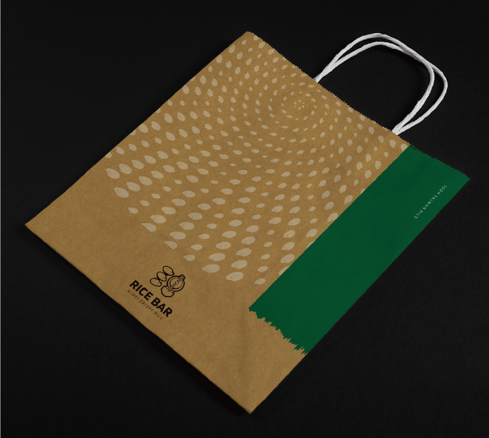
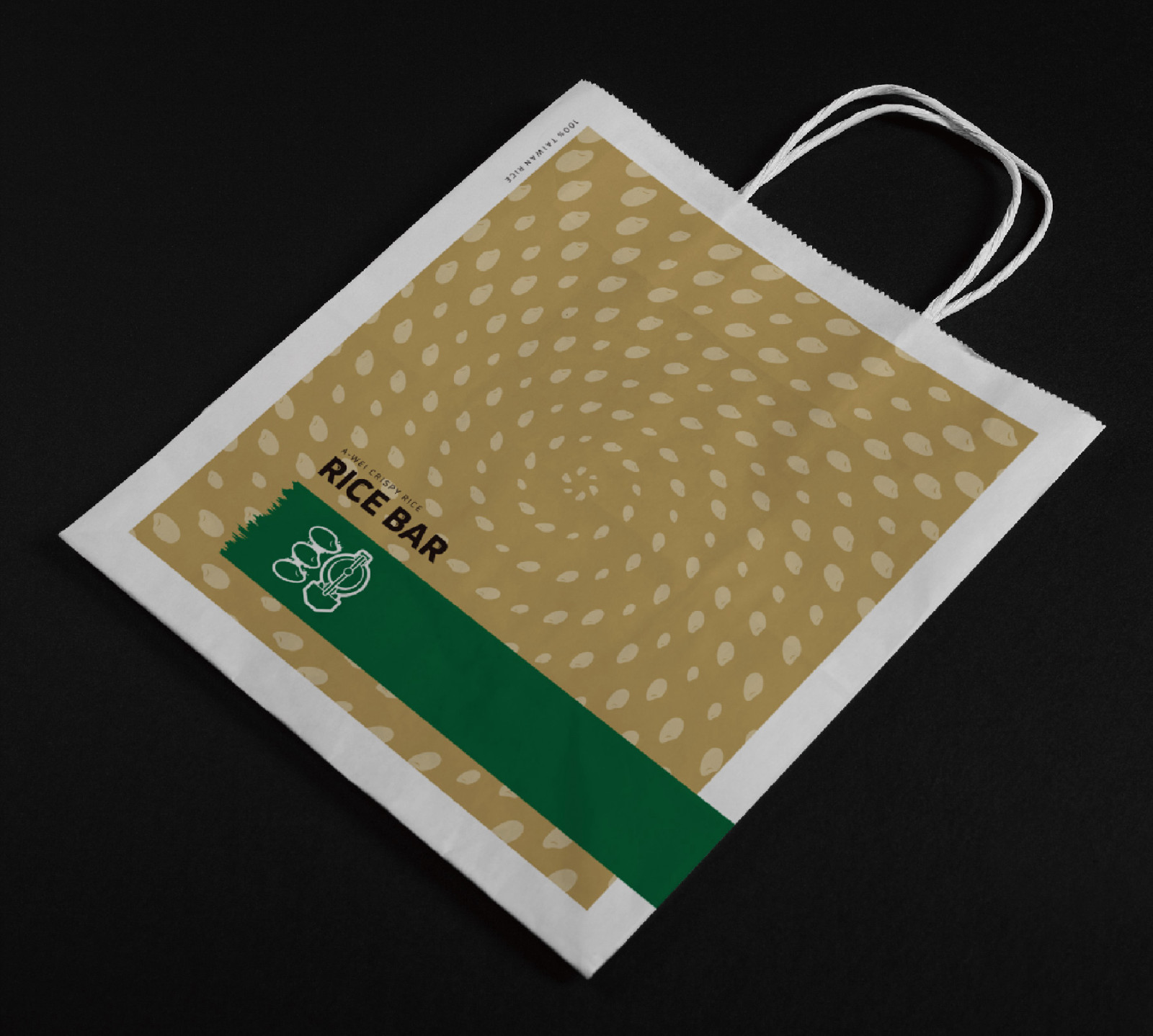
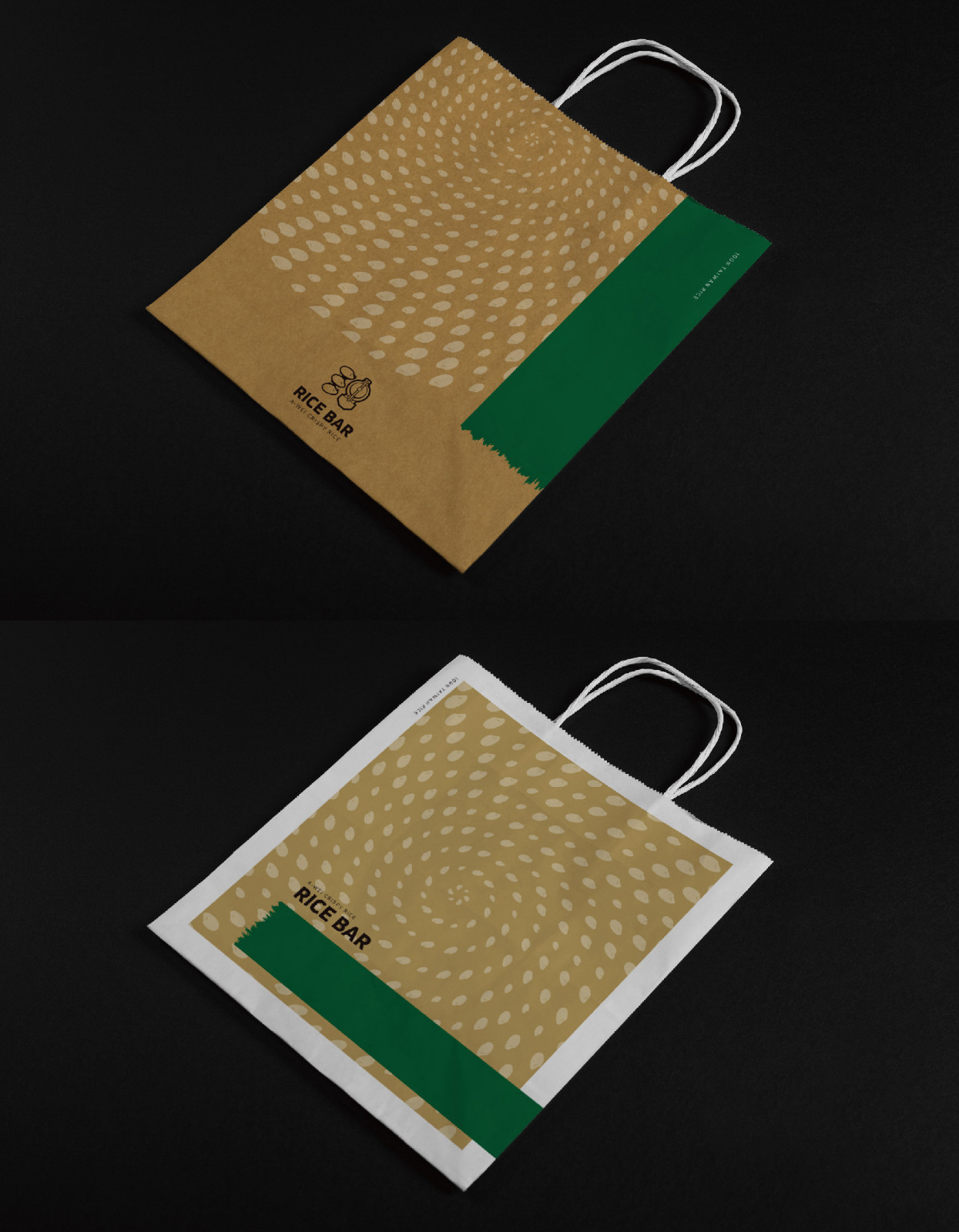
在識別設計上,我們將「米香棒的製作過程」化為視覺語彙:
左側展現稻米黏附麥芽的意象,右側則呼應阿瑋的招牌三輪爆米香車,
兩者合而為一,巧妙構成「瑋」字造型,打造獨一無二的品牌符號。
標準字則採用圓潤字體營造親和感,
並以米粒細節點綴,增添辨識度與記憶性。
透過品牌故事與識別的統合,阿瑋米香不僅重塑傳統零食的形象,
更把「米香」推向文化象徵的層次。它承載了土地的厚度與人情的溫度,
讓一口米香,成為彰化地方精神與文化傳承的縮影。
A-Wei Rice Bar originates from Changhua, founded by A-Wei after returning from Taipei to carry on the traditional craft with his signature tricycle. He insists on sourcing fresh, certified ingredients directly from local farmers, mastering the balance of heat and malt to achieve the perfect crisp yet non-sticky texture. The brand identity integrates the imagery of rice puffs and the tricycle, forming a unique symbol shaped as the character “Wei.” Beyond reinventing a traditional snack, A-Wei Rice Bar embodies the depth of the land and the warmth of human connection, becoming a cultural emblem of Changhua.